Inspired by the legendary manager Bill Shankly, the hotel had seen some hard times. Falling into administration, I was commissioned to rebrand and steer it away from the football references and memorabilia cluttering the property. It was a party hotel destination. It needed to be seen that way more than ever.
The big idea
Stay colourful
Liverpool is an incredibly diverse city, fun and exciting. the new premise needed to be evocative of the city it was placed in. You do see some colourful characters in Liverpool. Not just at the weekends. I wanted the premise to sum up that vibe. Effectively if you are here to experience the colour of this amazing city. You should stay colourful.
The Tonality Lens
The Creative
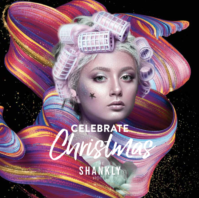
Colour, vibrancy and boldness in approach. Never subtle. Truly colourful.. An unmistakable visual look and feel as swathes of colour surround and bind all that they say and do. For recently created website to social tiles to menus, to wedding brochures.
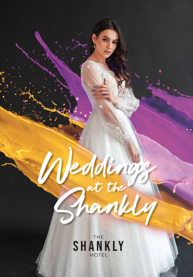
The colour continues to enshroud and enliven the bride. Wedding brochure cover.
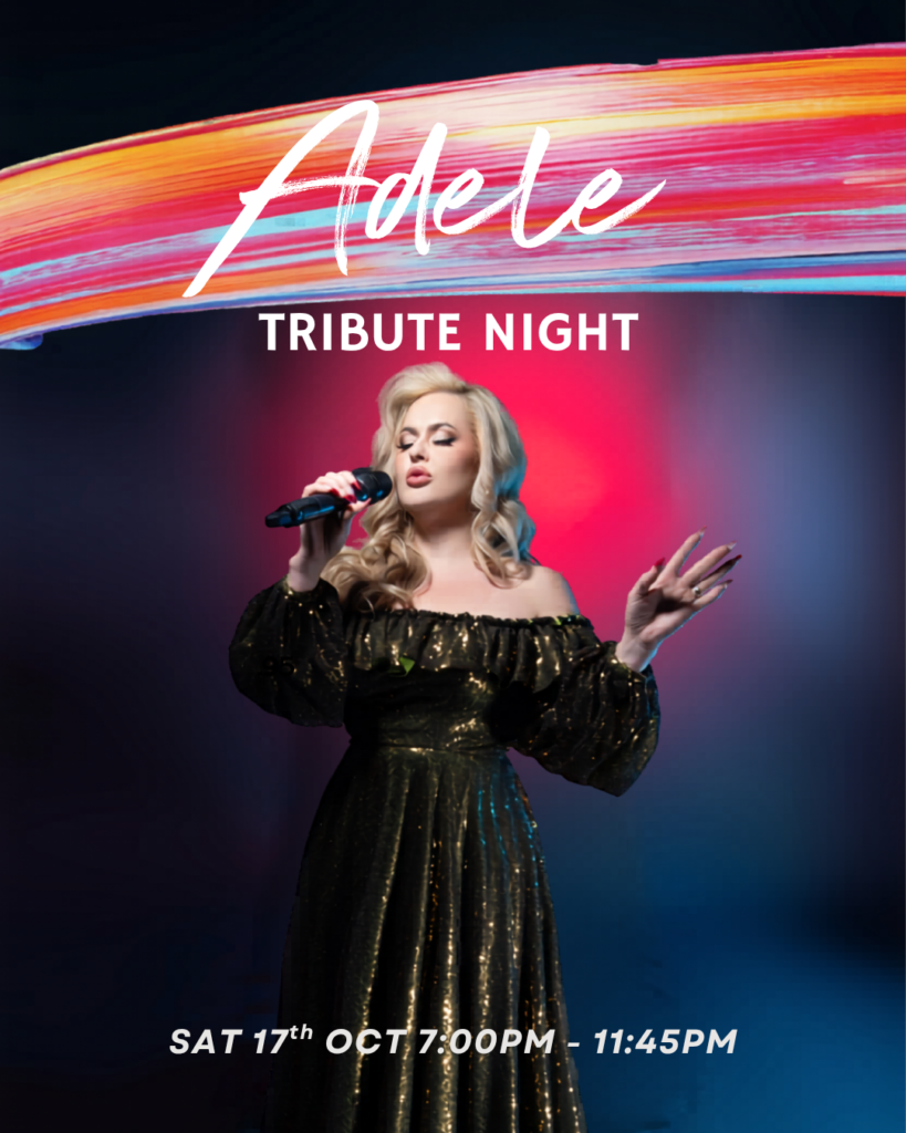
Social tiles for one of the many tribute acts.
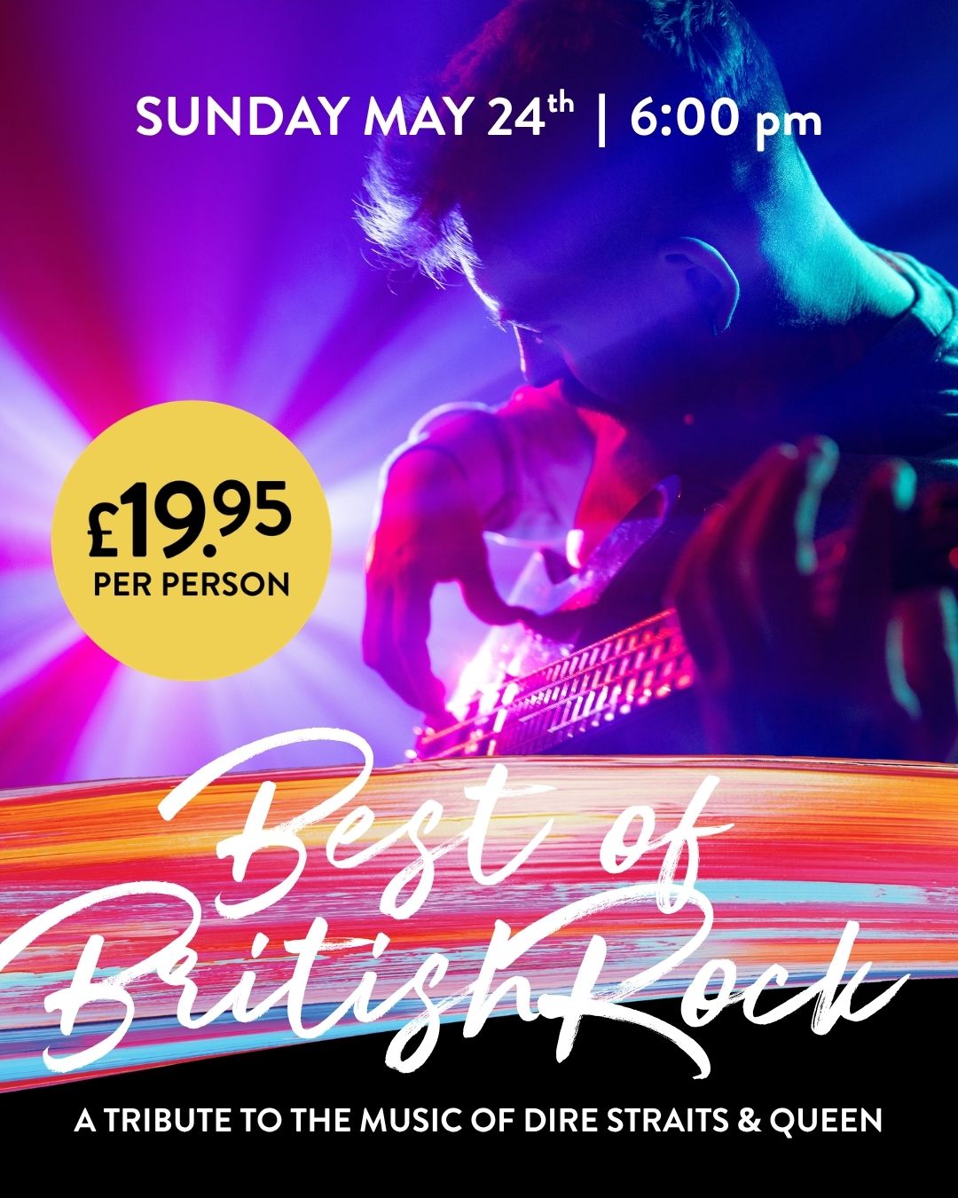
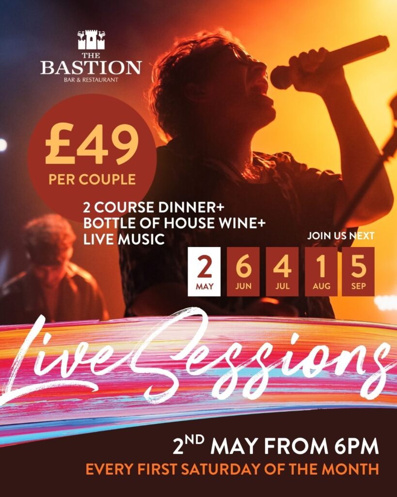
Social tiles for one of the live music events.
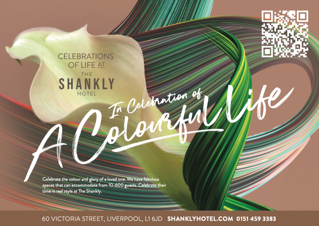
Press advert styling
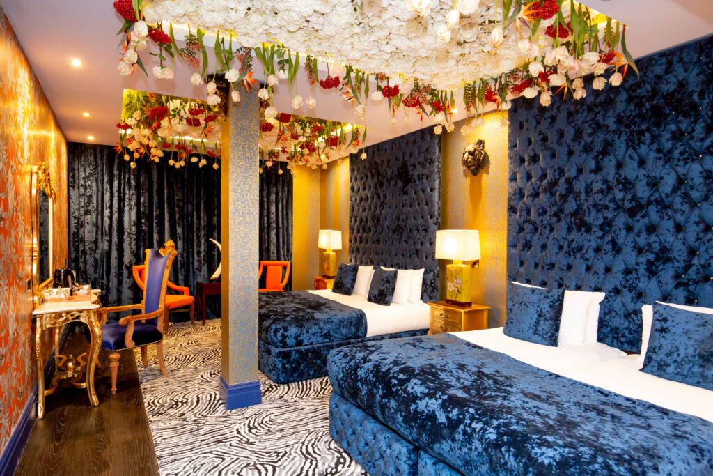
We cannot talk about anything else but colour when party bedrooms are similarly bold and lively
The Summary
I have worked with The Shankly since 2016 this start to finish approach highlights the need for an effective consistent and creative voice – managed by one consultant. Same guy creating the website, producing the assets, designing the menus, defining the voice. Let’s talk…
I am a highly experienced and commercially creative brand consultant who know exactly what makes your brand or business highly visible. With over 30 years experience.
Great hospitality branding creates a distinct competitive advantage. When a brand successfully marries an authentic narrative, flawless multi-sensory design, and a highly aligned team culture, it stops competing purely on price.