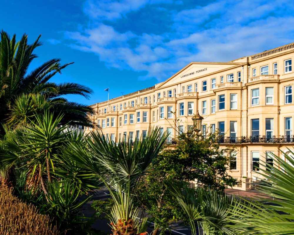
The Lansdowne has been family owned since 1912, that’s a pretty long time to be owned (and still operating). They had always been on the seafront. A part of the establishment. Consistency in hospitality is key. It’s a cornerstone of service.
It needed a sentiment that suggested that. Let’s not forget the sea – it has been and will always be here long after we are gone. There were so many tie ins with the sentiment of always. It was simply unavoidable
- The logo
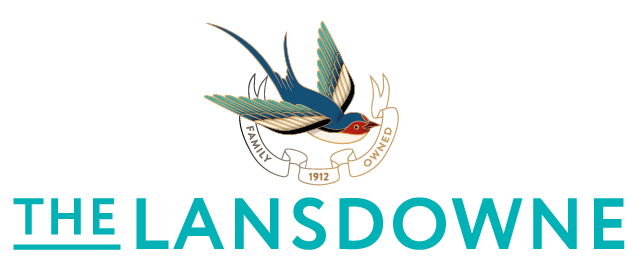
The swift logo was symbolic with a migrating bird flying south. Escaping the humdrum, flying to where the air is fresh and clean. this was then overlaid on a crest inscribed on one the pillars that no one took any attention of for years. Combined with the “Always here” sentiment, the date 1912 and you have the beginnings of a brand that is both elegant and contemporary. - The colour palette
The palette is similarly fresh, but sophisticated. Evocative of nature with a touch of luxury. - The expansion of Always
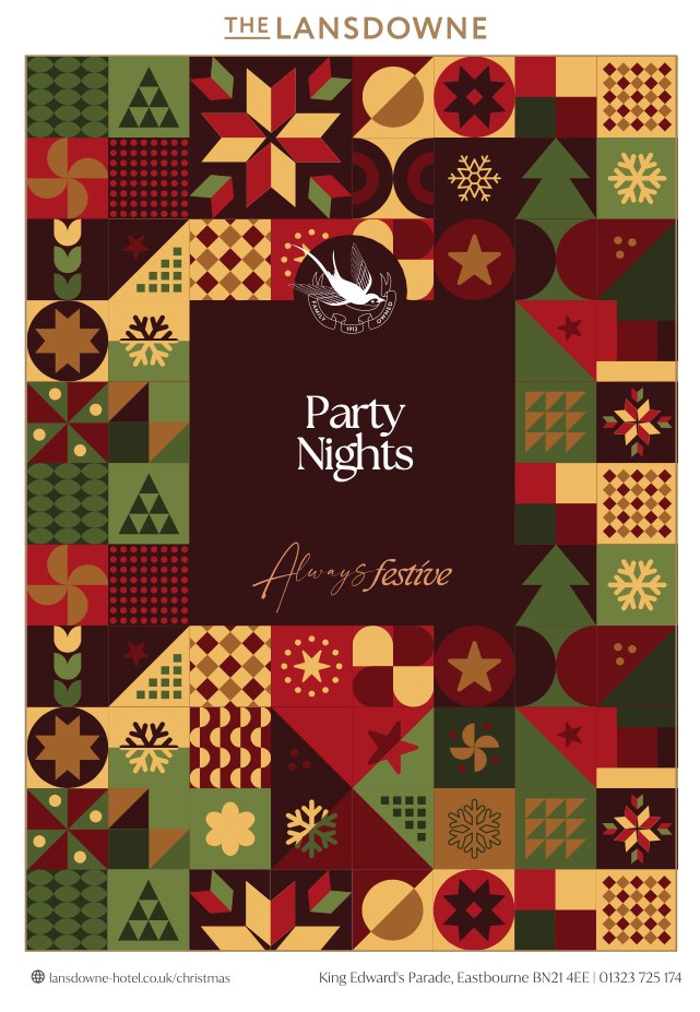
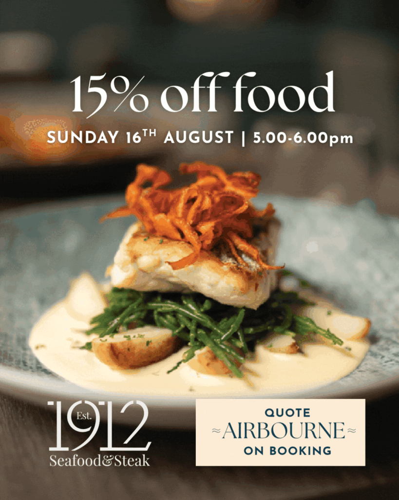
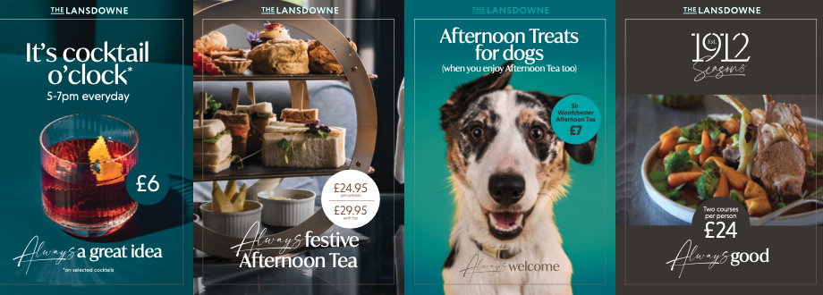
From here the idea expanded exponentially by using Always. Touching all collateral in terms of tonality and providing a simple to understand premise for its teams that consistency, family (in the broadest concept) and keeping things fresh were cornerstones of the service.